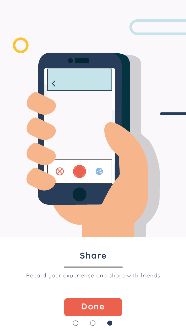
This is the second motion graphic piece that will be used within my AR app.
I did also try an receive feedback on this animation, but sadly I did not reach an amount I would have liked. This being said I will still take these comments into consideration. However as they are only a few minor changes and I am now in the process of creating the augmented app, I wont be pursuing them as my project has progressed further and I do not believe that these minor changes will effect the overall animation significantly enough.
Reddit After Effects Forum – https://www.reddit.com/r/AfterEffects/comments/7hptib/how_can_improve_this_video/
“Pacing. Motion is fine. Speed up everything. Play with some of your easing.”
“The tabletop moving across before the finger is mildly infuriating to me.
Following the substantial amount of feedback I received for my first initial motion graphic piece I thought it would be good to give something back to the audience and show them some hopeful improvements. Below I have added the final draft for my first initial animation that will be used for my AR app, all with advised improvements made.
Added squish to the side circles to make them seem more fluid
Changed timings so that there is some overlap between layers
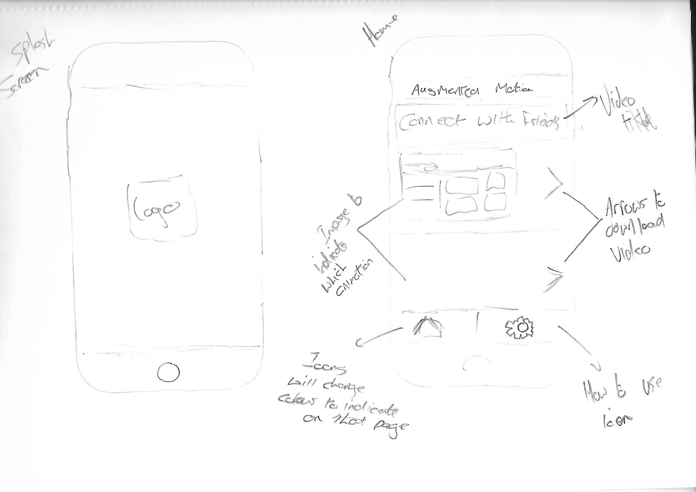
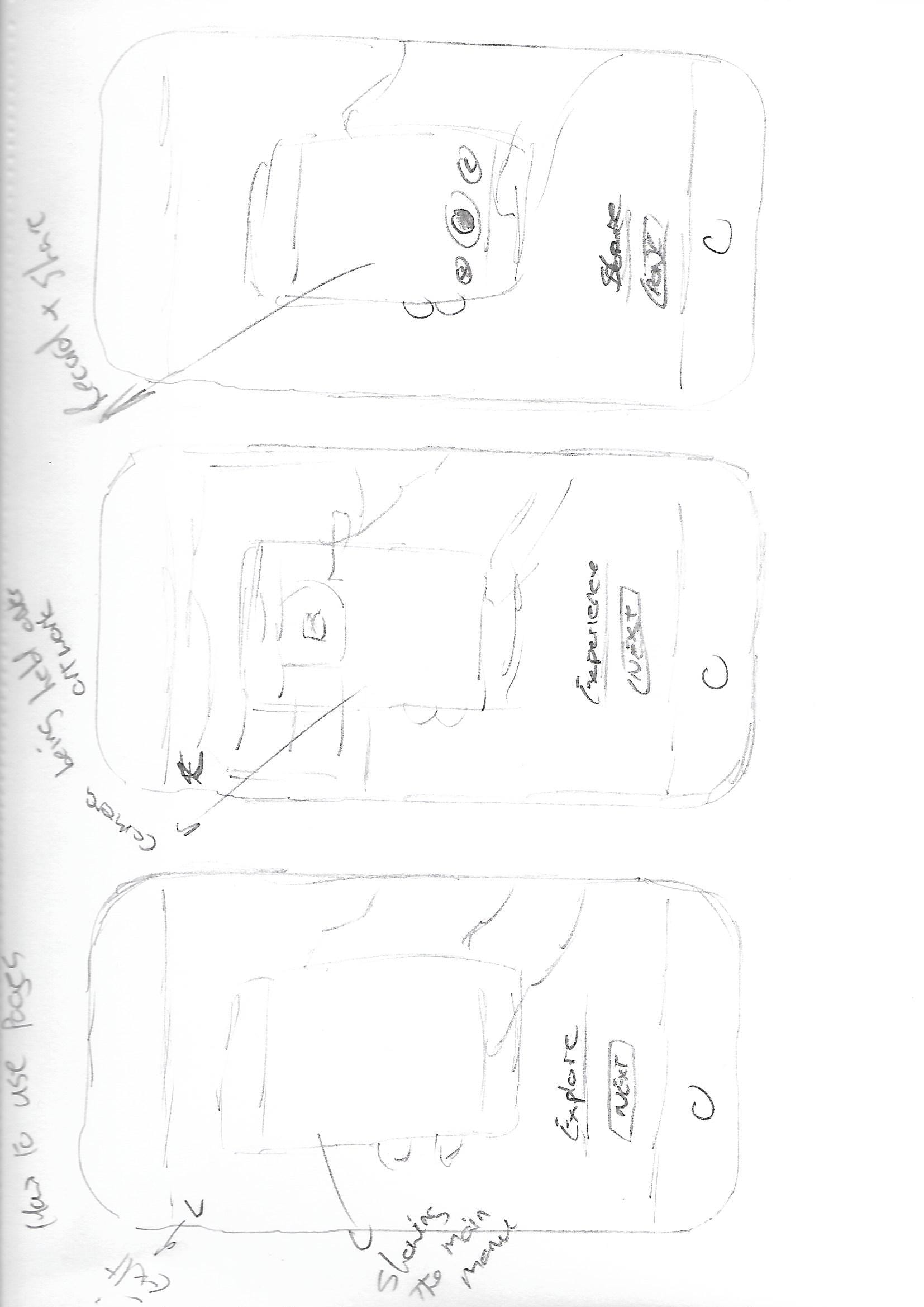
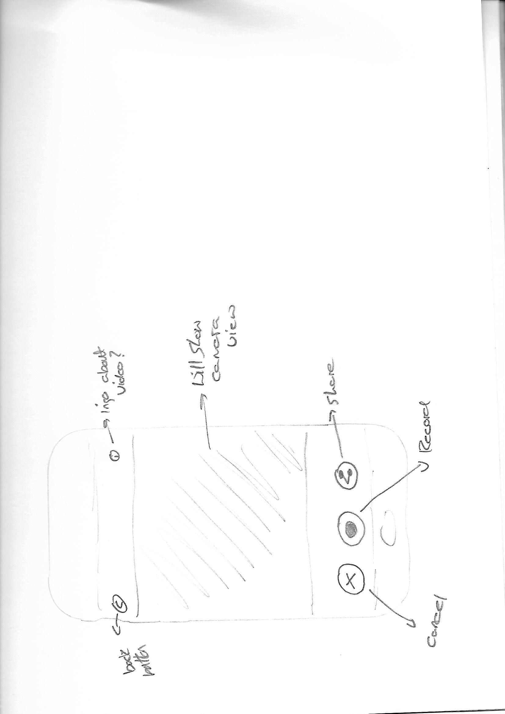
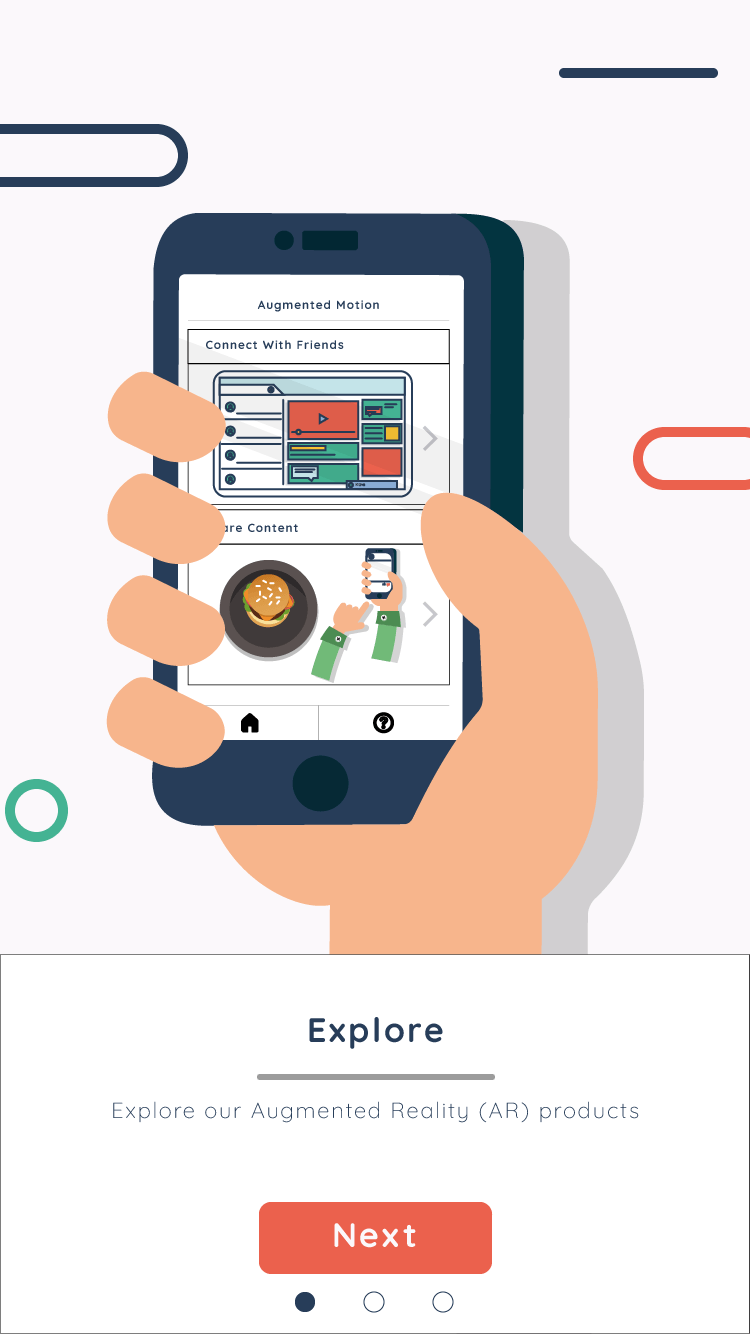
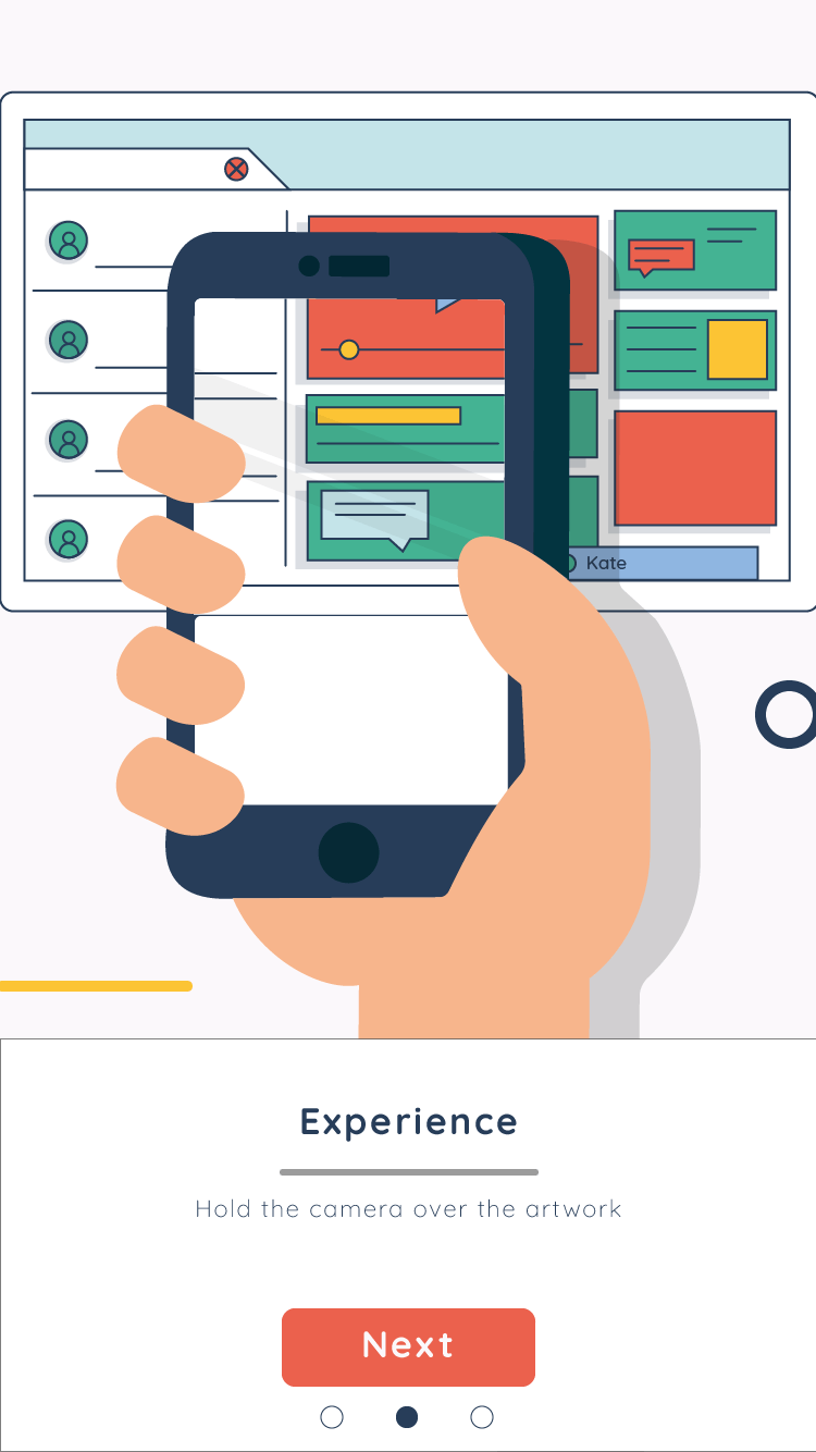
Following a discussion with one of my tutors it was advised that I should create a few app pages for my augmented reality side of the project. As the app is going to be simple in terms of content it was advised that I just include:
App Icon > Loading Screen/Splash Screen > Main Menu (If other features were present or options) > How to use > Augmented Reality Scene
From this I first began to draw out what these pages may look like, and from this I could then begin to wire-frame the app.
SPLASH SCREEN AND HOME PAGEHOW TO USEAR SCENE
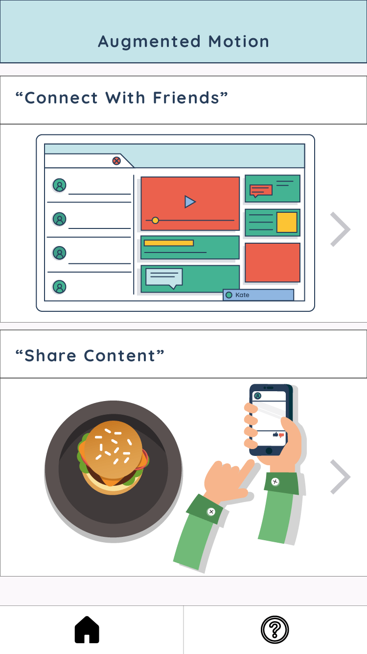
App Pages
This is the final outcome of the app pages that I wish to use for the AR app, I tried not to put too much attention into this as it would draw attention away from the development of the animations and working app. I wanted to ensure that the app was east to navigate and understand, all whilst keeping the style and theme I have chosen. By adding small elements to the splash page I have tried to give the illusion of motion, that these shapes are moving from the left of the screen to the right. I have also added an Adobe XD file to help in visualize how the app would look and operate on a mobile phone.
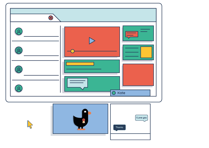
After posting my first initial draft of my motion graphic piece I thought it would be a good idea to get some feedback from professionals on ways in which it could be improved.
I received some positive and constructive feedback from this forum. It was very nice to see that the majority of the comments were positive on my animation and that only a few minor changes need to be made.
“Hey man, looks great so far! Love this color scheme and design, I think you could make this more dynamic tho. Some squash and stretch could be added to when the screen scales up. Also I think you could maybe try to speed it up juuuust a bit at some parts, try to always have something going on in your animation. Hope it helps :)”
“I don’t see how can it be done, the design is great, the animation is smooth, I don’t think there’s much room for improvement so far. Keep up the good work mate”
“In the beginning, scaling up of the browser/screen needs a sharper animation curve. Also its a bit simple compared to rest of the animation. Thats mainly because of the white space it creates. Graphic elements can come in while it is scaling up.”
“I love this for the most part. Really strong work. The only part that I feel wrong are the circles. The physics is off, they don’t fall or bounce right. Otherwise, excellent work. You may consider moving the cursor over a little bit for typing bit so it’s not over the text.
And if it were me, I would say every nerd knows that the correct response to “I love you.” is “I know.” ;)”
“Right when you click on the chat box have a blinking type icon pop onto screen almost immediately. It’ll help with the lack of movement going on between the chat popping up and the typing
Maybe in between the duck movement and the chatting of Kate you could have someone update a status or something on the left side of the screen.
Or or or you could have Kate initiate the chat with an icon popping up over the chat before it’s clicked. Because there is no audio it would help the audience determine a reason for why the character is originally clicking on the chat box. And when you click on the chat box it would have the chat swapped with who says what.
At the moment none of the other icons on screen give me any indication as to why the character would message Kate “I love you,” it just seems a little random. If you don’t want Kate to initiate the conversation then have one of the icons on the screen possibly have a pic of a girl with a heart. This is just a thought after watching this animation a ton of time.”
“Love the visual style! Never been able to nail that look myself, it’s impressive work. Someone mentioned the circles but I think that smoothing out the rest of the easing as well will make your project flow together a lot better. Right now it feels a bit stairstep-ish, how elements move almost in increments (esp. in the second half).”
“The design is great! In fact, your design skills are way ahead of your animation skills.
It’s not that your animation doesn’t have nice ideas in it – I actually like how everything forms – but as somebody mentioned: the physics are not right. More precisely, this has to do with your easing. Have a look at animation principles, this is a good overview: https://youtu.be/wtJeoPAGbfY.
I think you know there is something not completely right, you just couldn’t put your finger on it. If you fix your easing, i’m sure it will look fantastic.”
Surprisingly, as this is the main forum for Adobe content, I did not receive as near amount of feedback as I had thought. This was frustrating as it would have been very helpful to get opinions and ideas from people who actually work with Adobe. This being said the comment that I did receive will be taken into consideration.
“Don’t use AE to add & mix sound effect files. It sucks for that purpose. Use Premiere Pro.”
Conclusion
It is always a very positive thing to receive feedback on a project, no matter how little or bad, as it will help in knowing just how the project can be improved. The comments that I have received will all be taken into consideration. Following the comment from the Adobe forum, as my next animation piece will require some sort of sound effects too I will consider importing the file into Premiere Pro, where I will be able to add the sounds and edit them more effectively. The main piece of feedback that I received is that some of the animations seem a bit clunky, there is also empty space in some parts of the video where not much is going on. To amend these I will try to shorten the animation to help in removing any blank spaces, I will also try and make the ball physics smoother to give the illusion of a more realistic bounce.
Overall I am pleased with the feedback that I received as it has allowed me to understand how I may improve my first motion graphic. The majority of the feedback was quite positive also, gives me an ease of mind as I know I am able to make future motion graphic pieces with some level of skill.
After conducting tests and research into using AR I thought it would also be a good idea to conduct some tests using motion graphics within After Effects, as this will be a vital part of my project as it will be the main thing the users will see. I decided to follow a few basic tutorials to help myself in getting used to using the software.
In order to achieve the best quality in my motion graphic pieces, as well as an easy and manageable workflow, it was also important that I considered ways and techniques into using After Effects.
One important feature that I will need to ensure is working when animating my illustrator files is the ‘Continuously Rasterize’. By toggling this sunburst icon in After Effects (AE), it is instructing the file asset to redraw itself on every frame it is used. As a result AE will analyse the shape data within the source file and draw it from scratch every time, rather than using a rasterized snapshot of file as it is imported. This will allow me to scale and rotate my Illustrator files within AE, without the the worry of the image becoming distorted.
Here is an example to show the impact in quality this option has when creating a motion graphic. The top image shows the illustrator file mouse icon within after effects whilst the continuously rasterize option is ticked. The second image is the same file but without the rasterise ticked.