Kurzgesagt – In a Nutshell – https://www.youtube.com/watch?v=t7tA3NNKF0Q
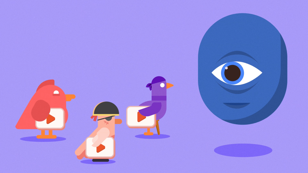
This video discusses how Facebook is stealing millions of views a day from independent creators. They have done this by creating an algorithm that when videos are uploaded into their player, they are preferred to YouTube links. This helps to keep as many users as possible on their site, so that they can then be shown advertisements. This method results in content creators receiving much less attention than they deserve. As well as this topic being important and informative it is also very appealing to watch. Through motion graphics and sound they can explain a theory in detail, all whilst keeping the viewers attention fixed.
This type of style is something that I would like to consider within my project, with bright colours and smooth transitions it makes these simple animations come to life. The assets that are used are made with a lot of detail, this helps in adding depth and an element of fun to the videos. I also believe that sound is a very important factor to help in making these videos enjoyable, when there is any transition or movement within the video there is some element of sound.
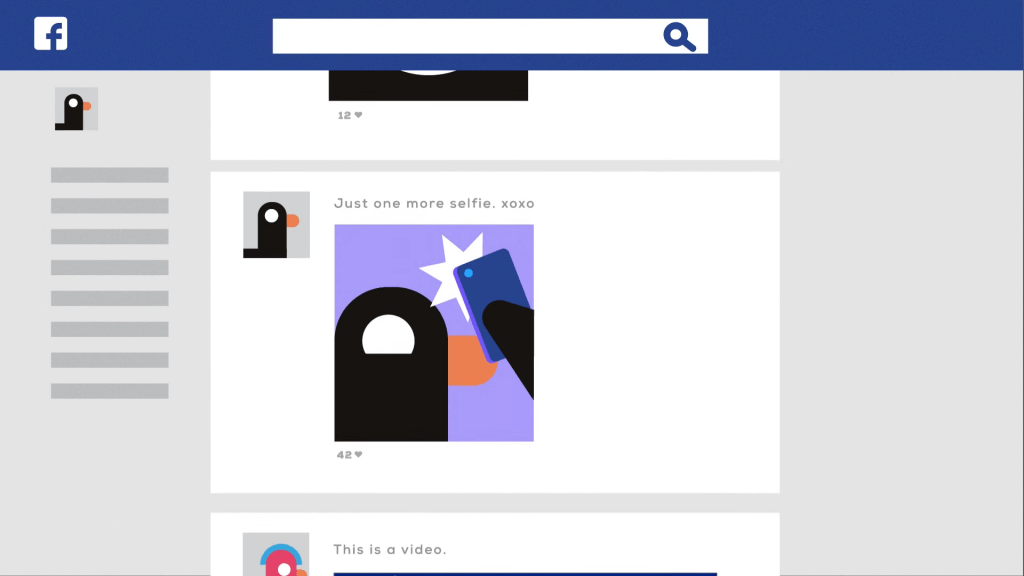
I also like the way in which these videos show the dashboard for a social media platform, the second image can easily be distinguished as some form of social media. This is something that I will need to consider as I will need to be able to show that what the viewer is seeing is a form of social media, without having to tell them.
Ahrefs – https://www.behance.net/gallery/36551745/Ahrefs
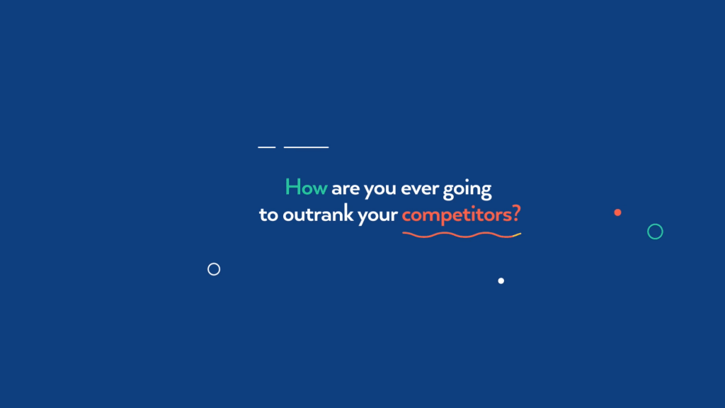
Ahrefs is a Search Engine Optimization platform (SEO), allowing their users to rank higher in search engines. This feature can be used for businesses to rank higher, increasing publicity and sales. I believe that the video that they made for this service is a great marketing technique as it is relevant to the service, and it is also very nice to watch, which will in turn keep the viewer entertained.
When a lot of simple components and animations are put together they make something that looks a lot more in depth and professional. The pastille colour and chunky style of assets help in making the video unique and memorable, which is something that I will need to consider within my videos. The use of colours and overall art style will help in making my videos all fit together. I am also going to take inspiration from the way in which this video shows a computer dashboard, as it will be a main component for one of my short motion graphics.
This videos use of sound is also a significant feature, it helps in making simple transitions like a line moving from one side of the screen to the other come to life. It helps in giving each component of the video a reason for being there, even though there are a lot of moving components the video does not seem cluttered. This is something that I will need to consider within my animations. I will need to include enough content so that it is interesting to watch, but not too much that it makes the video seem cluttered.
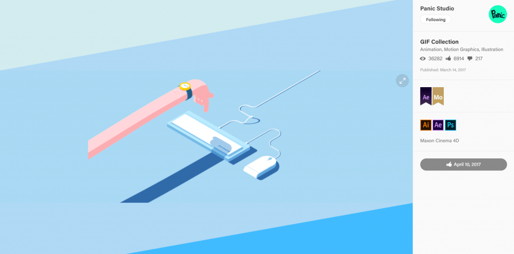
Panic Studio – https://www.behance.net/gallery/49558457/GIF-Collection
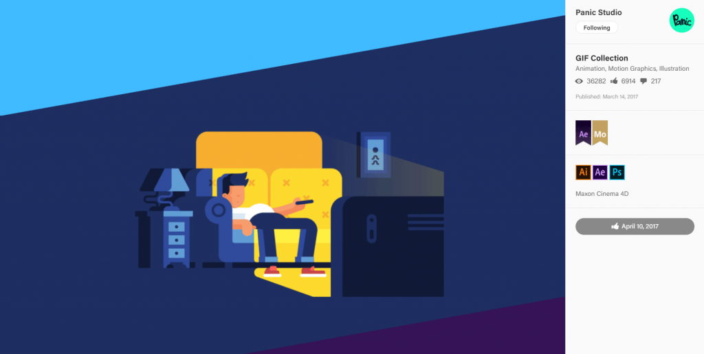
These are a series of short GIFs that help in bringing any mundane task to life. The amount of detail that each asset has helps in making these short and snappy animations fun and enjoyable, they do not need to run for any longer as they already show some sort of interesting story. This is something that I will need to consider within my animations as I do not want them to run for very long, but they still need to be entertaining and memorable.
As these short pieces are GIFs they do not have any sound, if sound was included I think it would help in adding more life to the characters, for example the sound of the TV playing or the buttons being pressed on the remote, creating another element to enjoy.
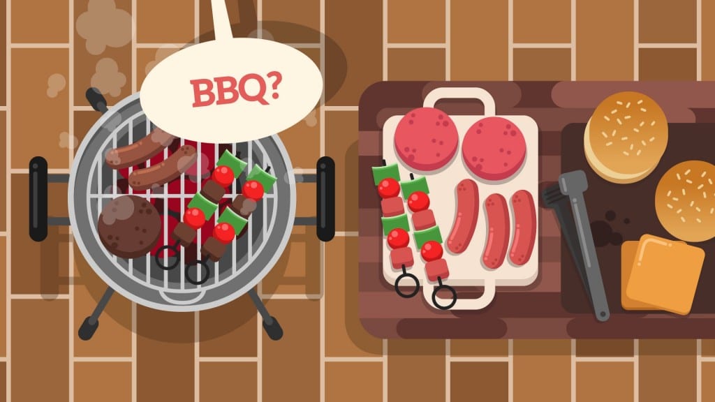
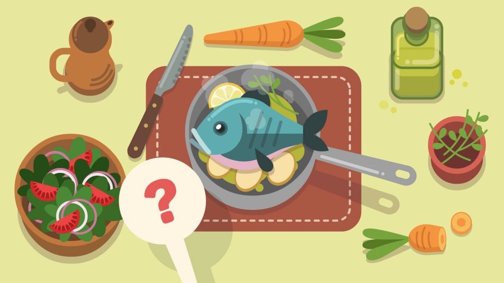
EAT IT! – https://www.behance.net/gallery/56350953/EAT-IT
A project by Nasser Pindarry helps to advertise and online food service that makes choosing food easier. I have chosen to include this piece as I would like to take into consideration the way in which the creator has taken these 2D images and added depth to them. Through the use of colour, shadows, and image layering it creates the illusion that the food is raising above the assets underneath it. Again the only other way I believe this piece could be improved would be to add mini sound effects over the small animations and transitions from one plate of food to the other, rather than just having a voice-over.





Leave a comment